How to Handle White Spaces in A Responsive Design
Table of Contents
Subscribe To Our Newsletter

Imagine you’re reading a book. The words are crammed together, with no space between lines or paragraphs. It’s hard to read, right? That’s where white space comes in.
Now, why is this important, you’d ask?
Well, according to studies, appropriate use of white space can increase user attention by up to 20%. That’s like grabbing someone’s attention in a crowded room!
So, it’s not just about making things look good; it’s about understanding the psychology behind it and improving how a website feels and functions.
In the vast landscape of web development and design, white space isn’t just an empty canvas—it’s basically a layout where everything has its own place and nothing is cluttered. Let’s explore the domain of white space and understand its significance in responsive design.
What is White Space?
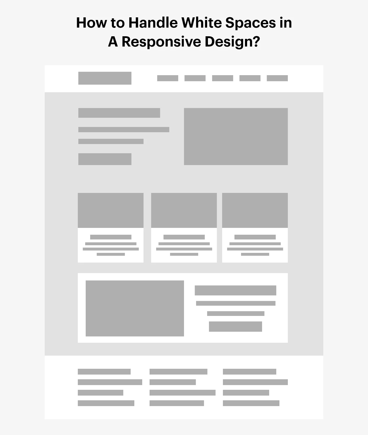
In web design, white space is the empty area between different parts of your website, like text, images, or buttons. It’s like the breathing room for your website’s content. In a responsive design, which adjusts to fit different screen sizes, white space helps make sure everything looks good and is easy to read, no matter what device someone is using.
How to Handle White Spaces in Responsive Design?
In simple terms, in web design and development, white spaces, also known as negative spaces, can be a great way to make the website easier to use, read, and look better. Here’s how you can handle white spaces in website design:

1. Adaptability: Make sure your design looks good on all devices. Adjust the empty space so it doesn’t look too crowded or too spread out.
2. CSS Media Queries: Use CSS media queries to change the empty space for different screen sizes. This could mean changing the margins and padding on smaller screens.
3. Grid Systems: Use grid systems like Bootstrap or Grid.css to manage empty space. They can help with both fixed and fluid grids.
4. Whitespace as a design element: Think of empty space as part of your design. It can help separate different parts of your design and guide users to specific content.
5. Typography: Change your text settings (like font size, line height, and letter spacing) for different devices to control the empty space in and around your text.
6. Breakpoints: Choose your breakpoints carefully. A good breakpoint can make better use of empty space and improve the user experience.
7. Responsive Images: Make sure images and other visuals also change for different screen resolutions, keeping a good balance of empty space around them.
8. Testing: Test your design on different screen sizes to see how the empty space changes, and how to adjust them as per your need.
The goal isn’t just to fill up the empty space, but to use it smartly to make your design friendlier for users and visually pleasing on all devices in UI UX development.
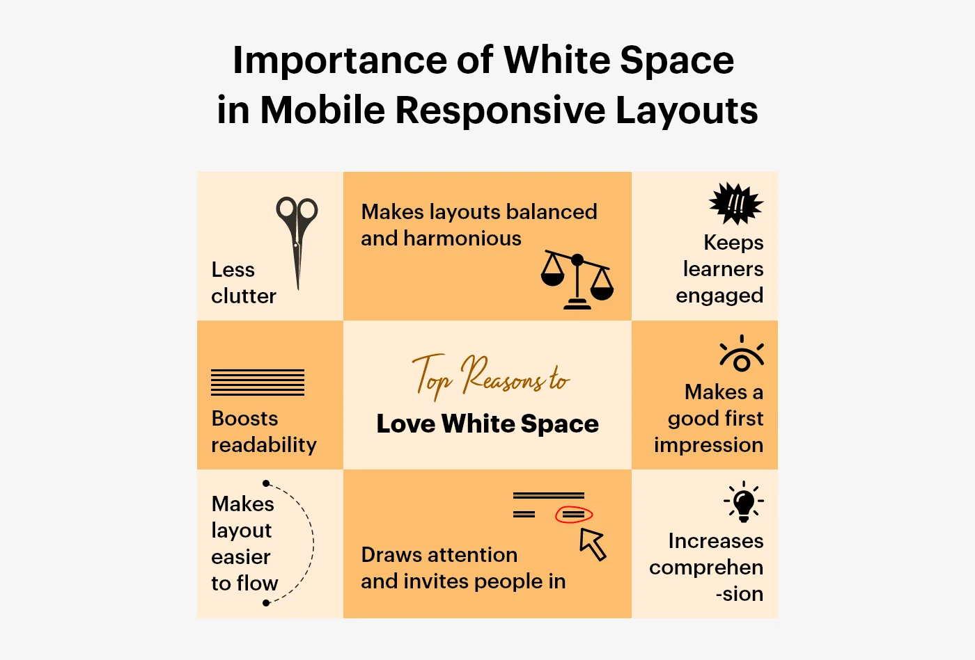
Importance of White Space in Mobile Responsive Layouts
Imagine you have a big box of colorful building blocks. Now, think of white spaces as the empty spots between those blocks. They’re like magic gaps that help us see and play with each block better.

In responsive design, it’s like having a special ability to make those gaps change size. Why? Some people use big screens, like a giant TV, and others use small screens, like a little phone. So, these magic gaps (white spaces) help everything look nice and friendly no matter how big or small the screen is.
It’s like playing with these blocks. You don’t want them all squished together; you want some space to see and enjoy each toy, right? White spaces do the same thing for the pictures and words on a computer or phone, making everything easy to read and pleasing to look at!
Types of White Spaces
In responsive design, white space plays a vital role in enhancing readability, guiding navigation, and drawing attention to key elements. Here are some types of white spaces used in responsive design:

1. Micro White Space: This refers to the tiny gaps between small elements like letters and lines. Adjusting micro white spaces can influence content legibility and readability, thus highly affecting the UX (user experience).
2. Macro White Space: This is the space between major elements such as the gap between a content block and a navigation bar. Adjusting the macro white space could guide visitors’ attention and help prioritize the content on a page.

3. Active White Space: This type of white space is used purposefully to help structure content and guide user navigation. It’s a proactive white space strategy that helps emphasize certain elements or sections.
4. Passive White Space: This is the white space that naturally occurs, such as the space between words and paragraphs. It’s not actively manipulated to enhance the design, but still important to maintain aesthetics and readability.

5. MARGINS and PADDING: These refer to the space around elements. Padding is the space between an element’s border and its content, while a margin is the space around an element’s outside border.
6. Gutters: These are white spaces used between columns to achieve a grid-based design. Gutters help separate distinct blocks of content and enhance readability, especially in multi-column layouts.
The purpose of white space in responsive design is not only to create a clean and uncluttered look, but also to improve user interaction and overall experience. The use of white space should therefore be thoughtful and strategic.
Also, read: How to Transform Web Development Game With AI
Tools for Managing White Space in Responsive Design
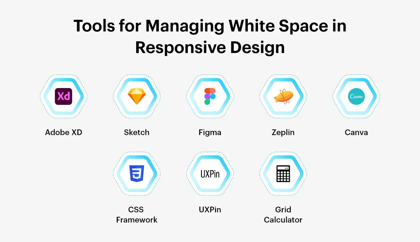
Managing white space well in responsive design is really important. It helps make your website look good, easy to read, and work efficiently. Here are some popular tools that can aid with this task:

CSS Frameworks (like Bootstrap, Foundation, Bulma, and Tailwind CSS): These tools help you adjust the space and position of things on your website for different screen sizes.
Adobe XD: This tool lets you design and prototype responsive designs. It helps you control and see the spacing and position of things on different screen sizes.
Sketch: This tool lets you edit vectors and has good responsive design features. It helps you control white space effectively.
Figma: This is a design tool that you can use online. It makes it easier to manage spaces between things in your design.
Zeplin: Zeplin helps by taking your design and giving all the details and code that developers can use. It can also help make sure your white space is used correctly.
Grid Calculator: This online tool helps you make a grid system for your website, which can help manage white space.
Canva: Canva makes it easy to keep a consistent amount of white space in your designs with its easy-to-use design features.
UXPin: This tool lets you adjust and keep responsive resizing and spacing in your web design & development project.
These tools all have features that make it easier to manage white space in web design and development, no matter the screen size. The best tool for you depends on what you need for your project and how much control you want over your design.
The Psychology of White Space in Responsive Design
Using white space in responsive design isn’t just about making it look good—it’s also about psychology. Using it correctly can greatly improve how a website feels and how easy it is to use.
White space can make text easier to read and understand, and it can help draw attention to important parts of the page. It can make buttons and other interactive elements stand out more, which can get more people to click on them. White space can also guide where people look on a page and give a sense of balance to a design.
Many high-end brands like Codiant use a lot of white space to give a feeling of luxury, and modern web designs and development often use it for a clean, uncluttered look. All in all, using white space well can make a website easier to understand and use.
Aspect | Impact |
| Readability | Easier text comprehension, reduced cognitive load |
| Attention | Draws focus to key elements, enhances user engagement |
| Interaction | Improves usability, encourages user interaction |
| Balance | Provides visual equilibrium, enhances overall design aesthetics |
| Luxury Branding | Conveys a sense of sophistication and luxury |
| Modern Design | Achieves a clean, uncluttered look, aligns with contemporary aesthetics |
Conclusion
In the vast world of web design and development, where pixels and codes dance, the magic of white space is often overlooked but never underestimated. Just like the air we breathe in a room; white space gives your website the breathing room it deserves. It’s the unsung hero that ensures your content isn’t cramped, making it a delightful experience for your visitors, no matter the screen size.
Handling white space in responsive design is an art. It’s about adaptability—making your design dance gracefully on every device. CSS media queries become your silent choreographers, guiding the spacing for different screens. Grid systems act like the supporting cast, ensuring harmony in both fixed and fluid layouts.
Remember, in the world of web design and development, white space isn’t just empty—it’s eloquent. It speaks volumes about clarity, simplicity, and user-friendly interfaces. As you embark on your design journeys, use these tips as your compass and let white space be your guiding star.
Here’s Codiant a web development agency, where innovation meets implementation, is here to transform your web presence.
As we explore the complex world of pixels and codes, let’s keep the excitement going. Stay tuned for more design insights, development wizardry, and digital delights.
Featured Blogs
Read our thoughts and insights on the latest tech and business trends
How AI Startups Can Claim R&D Tax Credits in 2026?
- April 28, 2026
- Artificial Intelligence
In a Nutshell The R&D tax credit allows AI startups to recover a portion of their innovation costs. Through R&D credits, startups can recover up to $500K per year against payroll taxes. You can typically... Read more
How to Identify High-ROI AI Opportunities in Your Business?
- April 27, 2026
- Artificial Intelligence
Artificial Intelligence has shifted from being an experimental technology to becoming a core driver of business growth. Today, organizations are no longer asking “Should we adopt AI?” they are asking “Where should we use AI... Read more
Build In-House vs Hire a Development Agency: Real Cost Comparison
- April 22, 2026
- Staff Augmentation
In a Nutshell In-house development offers control but comes with higher costs. Outsourcing reduces operational burden and speeds up delivery timelines. Hiring developers internally requires long-term financial commitments and management efforts. Development agencies provide flexibility... Read more


